Vertical Tabs & Cards Showcase helps you organize and display categorized content through a vertical tab navigation system. Add multiple categories and dynamic cards to showcase services, products, features, resources, and more with flexible layouts and customizable icons.
Vertical Tabs Card Showcase Documention
1. Introduction (Overview)
Vertical Tabs & Cards Showcase helps you organize and display categorized content through an interactive vertical navigation system. Create multiple categories, add dynamic cards, and showcase services, products, features, resources, or custom content with flexible layouts and customizable icons.
2. Key Features
- Vertical category navigation sidebar
- Category-based dynamic card filtering
- Add multiple categories and cards
- HubSpot icons and custom icon support
- 2-column and 3-column card layouts
- Custom category titles and icons
- Fully responsive across all devices
- Easy content management from HubSpot editor
- Fully responsive across all devices
3. Installation – Downloading the Module from HubSpot Marketplace
- Log in to your HubSpot account.
- Go to the Marketplace from the main navigation menu.
- Search for your module by name.
- Find the module in the results and click Install.
- If it’s a paid module, you can also click Buy Now to purchase and install directly.
4. How to Use – Adding the Module to Your Page
- Open your HubSpot page editor.
- Click on Add Module.
- Search for your module by name.
- Drag and drop the module into the desired section of your page.
-
5. Module Settings Guide
1. Content TabCategories & Cards
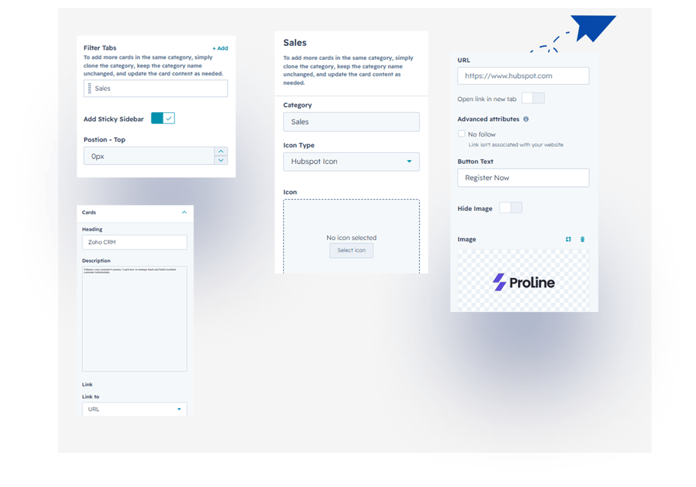
Add multiple categories and cards. Cards are displayed dynamically based on the selected category tab.
Category Icons
Choose an icon type for each category using either HubSpot icons or custom uploaded icons.
Card Customization
Customize each card with heading, description, image, button text, and button link options.
Sticky Sidebar
Enable or disable the sticky sidebar option to keep category navigation visible while scrolling.
2. Style Tab
Module Width
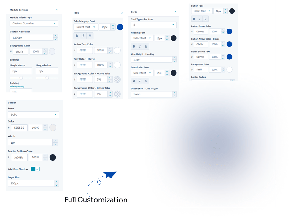
Control the overall spacing of the module to fit your page layout.
Module Spacing
Adjust top and bottom spacing to control the overall module layout.
Tabs Customization
Customize tab font, text color, active color, background color, border radius, and box shadow.
Card Customization
Customize card row layout, heading and description typography, font size, color, line height, arrow color, hover effects, border, box shadow, logo size, and border radius.
6. Examples / Demo Preview
View the module in action: https://www.modfrybus.shop/vertical-tabs-card-showcase
7. Support & Contact
For questions or support, contact us at productqueriemodfrybus@outlook.com We’re happy to help!