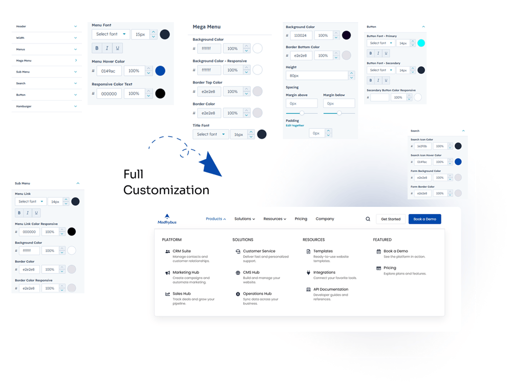
The Smart Mega Menu module makes it easy to build modern website navigation directly within HubSpot. Simply add the module to your page or global header, configure your menu items, and customize the layout, styling, and navigation settings to match your website. Once published, the menu provides a responsive and user-friendly navigation experience across desktop, tablet, and mobile devices.
5. Module Settings Guide
Content Tab:
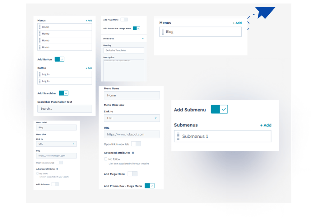
1. Logo – Upload your website logo and customize its size, spacing, and link destination.
2. Navigation Menu – Add unlimited top-level menu items and organize your website navigation with ease.
3. Mega Menu Panel – Convert any menu item into a multi-column mega menu and display rich navigation content.
4. Column Layout – Choose from 2, 3, or 4-column layouts to organize links and content efficiently.
5. Dropdown Menu – Create standard dropdown menus for simple and clean navigation.
6. Nested Submenus – Build multi-level navigation with unlimited nested submenu items.
7. Featured Content – Highlight important pages, products, or services inside your mega menu panel.
8. Promo Box – Add promotional cards with images, headings, descriptions, and CTA buttons.
9. Search Bar – Enable or disable the built-in search bar to help visitors quickly find content.
10. CTA Buttons – Add up to two customizable call-to-action buttons with independent show/hide controls.
11. Menu Icons – Add icons to menu items within mega menu columns to improve navigation and visual appeal.
12. Link Settings – Configure internal or external links, open links in a new tab, and manage navigation behavior.
13. Responsive Mobile Menu – Configure how the navigation is displayed on mobile devices with a responsive hamburger menu.
14. Visibility Controls – Show or hide the search bar, CTA buttons, promoboxes, and other optional elements.
2. Style Tab
1. Module Settings:
Customize section spacing, background color, and container width with full-width or custom-width options.
2. Layout Settings – Adjust the overall layout, spacing, and alignment of the navigation.
3. Color Settings – Customize colors for the background, text, links, hover states, and active menu items.
4. Typography – Change the font size, weight, line height, and text styling for menu items and headings.
5. Header Styling – Customize the header background, borders.
6. Mega Menu Panel – Style the mega menu panel with custom backgrounds, borders and border radius.
7. Dropdown Menu – Customize the appearance of dropdown menus, including colors and hover effects.
8. Promo Box Styling – Control the design of promo boxes, including backgrounds, borders, text, and buttons.
9. Search Bar – Customize the search field, icon, colors, border, and focus styles.
10. CTA Buttons – Style both CTA buttons with custom colors, typography, borders, hover effects, and spacing.
11. Mobile Menu – Customize the mobile navigation, hamburger icon, menu panel, and mobile menu item styles.
13. Responsive Settings – Fine-tune spacing and styling for desktop, tablet, and mobile devices.