5. Module Settings Guide
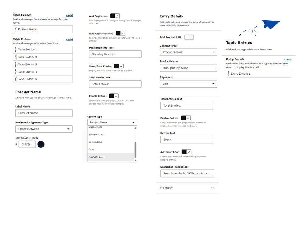
Content Tab:
- Table Header : Add and manage the column headings for your table.
- Table Entries : Add and manage table rows from here.
- Content Type : Select the type of content for the table cell, such as product name text, custom icon, HubSpot icon, in stock, out of stock, discontinued, date, etc.
- Product Name : Add and manage the column headings for your table.
- Add Pagination : Enable pagination to navigate through multiple pages of entries.
- Add Pagination Info : Show pagination details such as "Showing 1 to 1 of 1 entries."
- Pagination Info Text : Customize the text displayed for pagination info (e.g., Showing 0 entries).
- Show Total Entries : Display the total number of entries available.
- Total Entries Text : Customize the label text for total entries.
- Enable Entries : Show the entries-per-page control to let users choose how many entries to display.
- Add Product URL : Configure product URL settings for table cells.
- Content Type : Select the type of content for the table cell (e.g., Product Name).
- Alignment : Set horizontal alignment for cell content (e.g., Left).
- Entries Text : Customize the text label for the entries-per-page control.
- Add SearchBar : Enable the search bar to let users quickly find specific entries.
- Searchbar Placeholder : Set placeholder text for the search bar (e.g., Search products, SKUs, or status...).
- No Result : Configure the display message or settings when search results yield no matches.
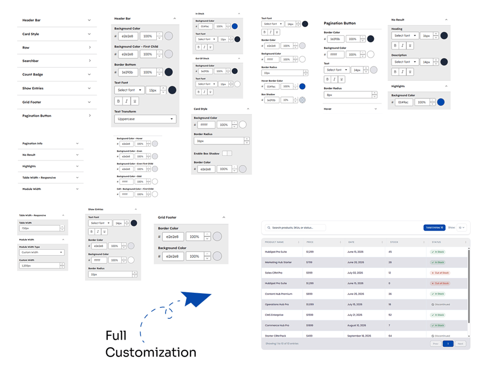
2. Style Tab
- Header Bar : Customize the background color, first child background color, border bottom, text font, text transform, hover background color, even/odd background colors, and cell background color for the header bar.
- Card Style : Customize the background color, border radius, box shadow toggle, and border color for the card style.
- Row : Customize background color on hover, even background color, even first child background color, odd background color, first child cell background color, bottom border color, text font styling, and text color on hover for table rows.
- Searchbar : Customize font styles, border color, background color, border radius, hover border color, and box shadow for the search bar.
- Count Badge : Manage styling options for count badges such as total entries badges.
- Show Entries : Configure text font, border color, background color, and border radius for the show entries dropdown controls.
- Grid Footer : Customize border color and background color for the grid footer.
- Pagination Button : Customize border color, background color, text font, and border radius for pagination buttons.
- Pagination Info : Manage styles and layout for pagination information text.
- No Result : Configure heading and description font styles and highlight background colors when no search results are found.
- Highlights : Set background colors for keyword highlights.
- Table Width - Responsive : Define table width configurations for responsive displays.
- Module Width : Set module width type (e.g., Custom Width) and specific pixel dimensions for the module.
- In Stock : Customize background color, text font, and styling options for the "In Stock" status badge.
- Out Of Stock : Customize background color, text font, and styling options for the "Out Of Stock" status badge.
- Discontinued : Customize background color, text font, and styling options for the "Discontinued" status badge.
- Enable Cell Borders : Toggle cell borders on or off for the table layout.
- Icon - Hubspot/Custom : Configure icon size and styling settings for HubSpot and custom icons.