Bento Grid Module: Create responsive, customizable grid layouts with multiple cards for images, text, and links. Perfect for portfolios, products, or services, fully mobile-friendly and modern.
Smart Bento Grid Documention
1. Introduction (Overview)
2. Key Features
- Multiple Grid Cards – Add and display as many cards as needed.
- Flexible Layout Options – Easily arrange cards in multiple styles and adapt the grid to fit your content perfectly.
- Responsive Design – Grid automatically adapts for desktop, tablet, and mobile.
- Equal Height Cards – All cards maintain equal height for a clean, organized look.
- Customizable Content – Add headings, descriptions, images, and links.
- Spacing & Alignment Control – Adjust spacing inside cards and content alignment.
- Full Styling Control – Customize fonts, colors, backgrounds, and borders to match your design.
3. Installation – Downloading the Module from HubSpot Marketplace
- Log in to your HubSpot account.
- Go to the Marketplace from the main navigation menu.
- Search for your module by name.
- Find the module in the results and click Install.
- If it’s a paid module, you can also click Buy Now to purchase and install directly.
4. How to Use – Adding the Module to Your Page
- Open your HubSpot page editor.
- Click on Add Module.
- Search for your module by name.
- Drag and drop the module into the desired section of your page.
-
Bento Grid Module: Design fully responsive, visually appealing grid layouts with multiple cards. Each card can include images, headings, descriptions, and links. Perfect for portfolios, product showcases, services, or any content needing a clean, organized, modern, and mobile-friendly presentation.
5. Module Settings Guide
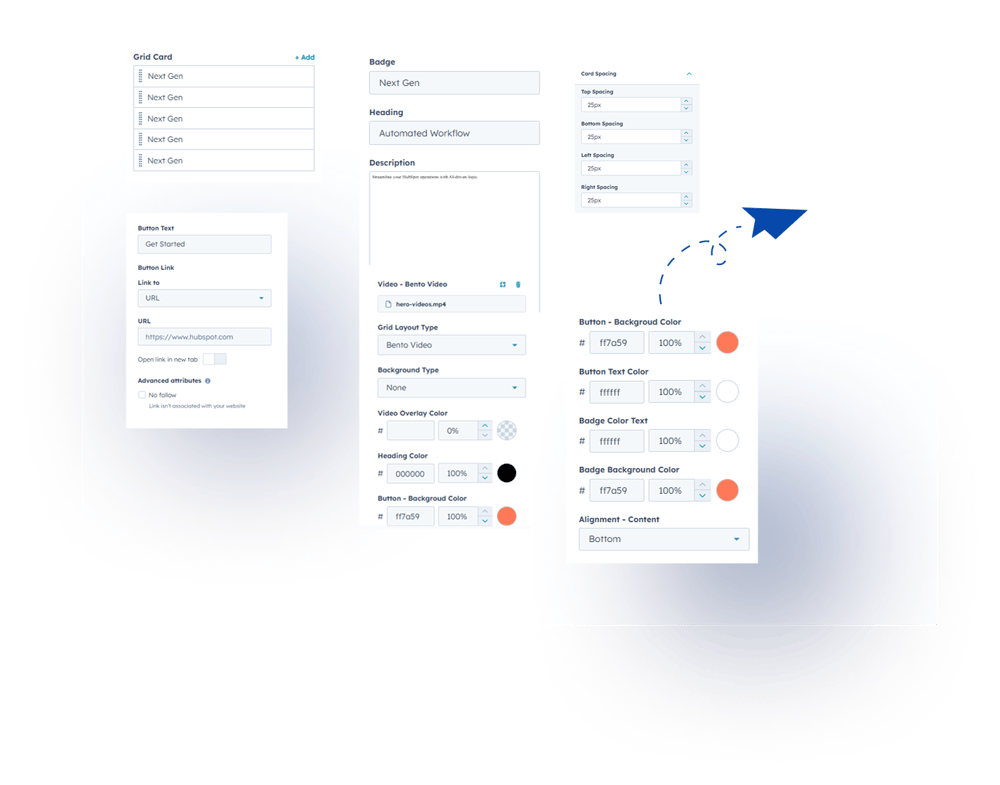
1. Content Tab- Add & Edit Multiple Grid Cards – Easily add or modify multiple cards.
- Customizable Content – Set title, description, badge, URL, and button text.
- Grid Layout Options – Choose from different layout types per your design needs.
- Style Customization – Adjust headline color, button text color, badge color, and alignment.
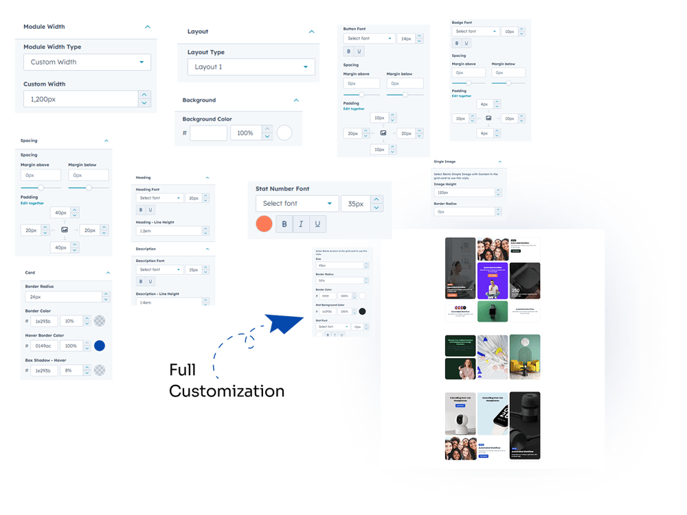
2. Style Tab
- Module Settings: Set module width (full or custom), spacing, and overall color options.
- Module Spacing: Control spacing separately for desktop.
- Layout Options – Choose and adjust grid layout style.
- Background Customization – Set full module background color.
- Content Customization – Adjust text color, font size, font family, button font color & background, stat number color, spacing.
- Card Customization – Configure border color, hover border color, box shadow on hover, border radius.
- Avatar Customization – Set avatar size, border color, and stat background color.
- Image Settings – Adjust image height and border radius.
- Video Settings – Set minimum video height.
- Fully Customizable: Customize every element to match your design and layout needs.
- Fully Responsive: Works seamlessly across desktop, tablet, and mobile devices.

6. Examples / Demo Preview
View the module in action:https://www.modfrybus.shop/smart-bento-grid
7. Support & Contact
For questions or support, contact us at productqueriemodfrybus@outlook.com We’re happy to help!