5. Module Settings Guide
Content Tab:
1. General Configuration & Sidebar Controls
- Add Pagination: Toggle to enable pagination across resource items.
- Pagination Per Page: Sets the maximum number of posts per page.
- Filters Position - Right Side: Toggle to shift the filter sidebar to the right.
- Maximum Price - Range Slider: Defines the maximum cap for the price filter.
- Currency Symbol: Specifies the currency symbol like dollar ($).
- Result Count Text: Label text showing filtered result quantities.
- Header - Filter Text: Heading text displayed above the filters.
- Reset All Button: Label text for clearing all active filters.
- Search Placeholder Text: Hint text inside the search input box.
2. Filter Labels & Defaults
- All Categories - Default: Default display label for the category dropdown.
- Dropdown Label 2: Custom label for the second filter dropdown.
- Dropdown Label 3: Custom label for the third filter dropdown.
- Dropdown Label (Category): Custom title label for the main category dropdown.
- Add Price Range Slider: Toggle switch to enable the price range slider.
3. Categories & Content Format Fields
- Category Name: Defines the specific category title for resource posts like Marketing.
- Format: Specifies the resource content format type like Whitepaper.
4. Resource Post Repeater Item (Posts)
- Title: Resource post title for item identification.
- Description: Summary for resource post
- Add Image / Feature Image: Toggle and image picker for thumbnail upload.
- Button Text: Label for the call-to-action button.
- Button Link & Attributes: URL configuration with new tab and no-follow options.
- Date (Newest/Oldest): Date picker for sorting filters.
.png?width=1000&height=750&name=Group%201000002507%20(1).png)
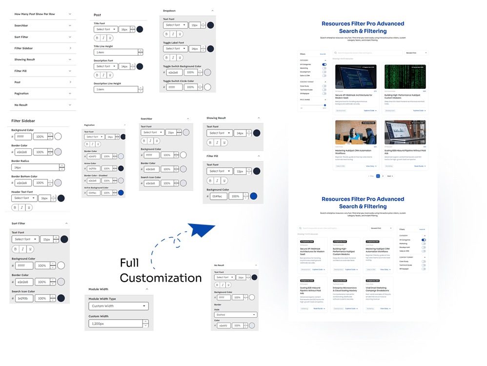
Style Tab:
1. General Layout & Structure
- How Many Post Show Per Row: Sets the number of resource columns per row layout.
- Module Width Type: Selects layout width option like Full Width or Custom Width.
- Custom Width: Defines custom pixel width constraint for the module container.
2. Filter Sidebar Styles
- Background Color: Sets background color for the filter sidebar box.
- Border Color: Defines border outline color for the sidebar container.
- Border Radius: Adjusts corner rounding radius for the sidebar box.
- Border Bottom Color: Specifies bottom border styling color for sidebar sections.
- Header Text Font: Configures font family, size, and weight for header titles.
3. Searchbar & Sort Filter Styles
- Text Font: Sets typography settings for search input or sort text.
- Background Color: Configures background color for search or sort elements.
- Border Color: Defines border outline color for search and sort boxes.
- Search Icon Color: Specifies color styling for the search input icon.
4. Dropdown & Toggle Switch Styles
- Text Font: Configures font family and size for dropdown labels.
- Toggle Label Font: Sets typography styles for toggle switch titles.
- Toggle Switch Background Color: Changes background color for toggle switch components.
- Toggle Switch Circle Color: Defines active handle circle color for toggles.
5. Post Card Styles
- Title Font: Configures typography style, size, and weight for post titles.
- Title Line Height: Sets line spacing height for the post card title.
- Description Font: Sets font family and size for description text paragraphs.
- Description Line Height: Adjusts line spacing height for descriptions.
- Button Text Color: Sets text color for button labels.
- Category Text Color: Defines text color for category labels.
- Format Text Color: Defines text color for format items.
- Date Text Color: Defines text color for date labels.
- Price Text Color: Defines text color for price values.
6. Pagination Styles
- Text Font: Configures font family and size for pagination numbers.
- Border Color: Sets outline border color for pagination buttons.
- Arrow Color: Defines color styling for pagination navigation arrows.
- Border Color - Disabled: Sets border color for inactive pagination buttons.
- Active Background Color: Configures background color for the current active page.
7. Showing Result & Filter Pill Styles
- Text Font: Configures typography style for result counts or pill labels.
- Background Color: Sets background fill color for active filter pill elements.
8. No Result State Styles
- Text Font: Configures typography style for no-result feedback messages.
- Background Color: Sets background color for the empty state container.
- Style: Defines border style type like dashed or solid lines.
- Color: Sets outline border stroke color for the empty state box.