Resource Directory Pro Documention
1. Introduction (Overview)
Resource Directory Pro is designed to help you organize and showcase all your valuable resources in one place. Add guides, ebooks, reports, case studies, and other content, then let visitors easily find what they need using category tabs, filters, live search, sorting, and grid or list views.
The module also includes pagination for large resource collections and a popup details view that lets visitors click the button on a resource card to view its complete information without leaving the page.
2. Key Features
- Search Resources – Quickly find resources using live search.
- Category Tabs & Filters – Browse and filter resources by category.
- Grid & List View – Switch between grid and list layouts.
- Sort Resources – Sort posts by newest, oldest, or A–Z.
- Multiple Resources - Add and manage as many resources as needed.
- Popup Details – Click the button on any resource card to view its full details in a popup.
- Pagination – Keep large resource collections clean and easy to browse.
- Responsive Design – Works smoothly across desktop, tablet, and mobile.
3. Installation – Downloading the Module from HubSpot Marketplace
- Log in to your HubSpot account.
- Go to the Marketplace from the main navigation menu.
- Search for your module by name.
- Find the module in the results and click Install.
- If it’s a paid module, you can also click Buy Now to purchase and install directly.
4. How to Use – Adding the Module to Your Page
- Open your HubSpot Page Editor.
- Click Add in the left sidebar.
- Search for Resource Directory Pro.
- Drag and drop the module onto your page.
- Add your resources and configure the available settings.
- Customize your resource cards with images, titles, descriptions, buttons, categories, search, filters, sorting, grid/list view, and pagination as needed.
- Click Publish or Update to save your changes.
5. Module Settings Guide
Content Tab:
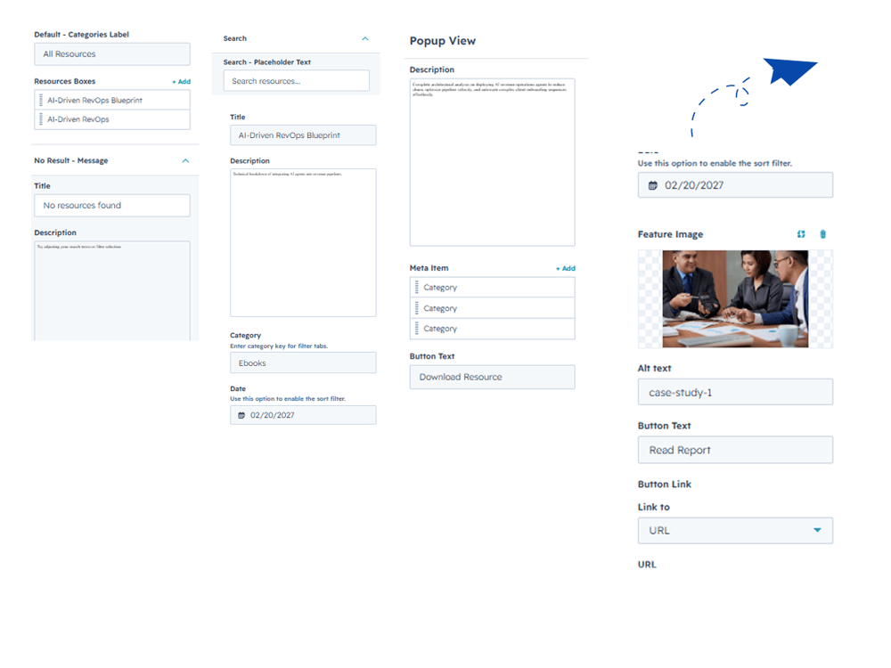
- Categories – Add and customize category names to organize your resources.
- Resource Boxes – Add multiple resource cards with a title, description, category, date, image, and button text.
- Popup View – Customize the popup with a description, meta information, and button text.
- No Results Message – Add a custom title and description to display when no resources match the search or filters.
- Search – Customize the search placeholder text.
- Pagination – Set the number of resources to display per page.
2. Style Tab
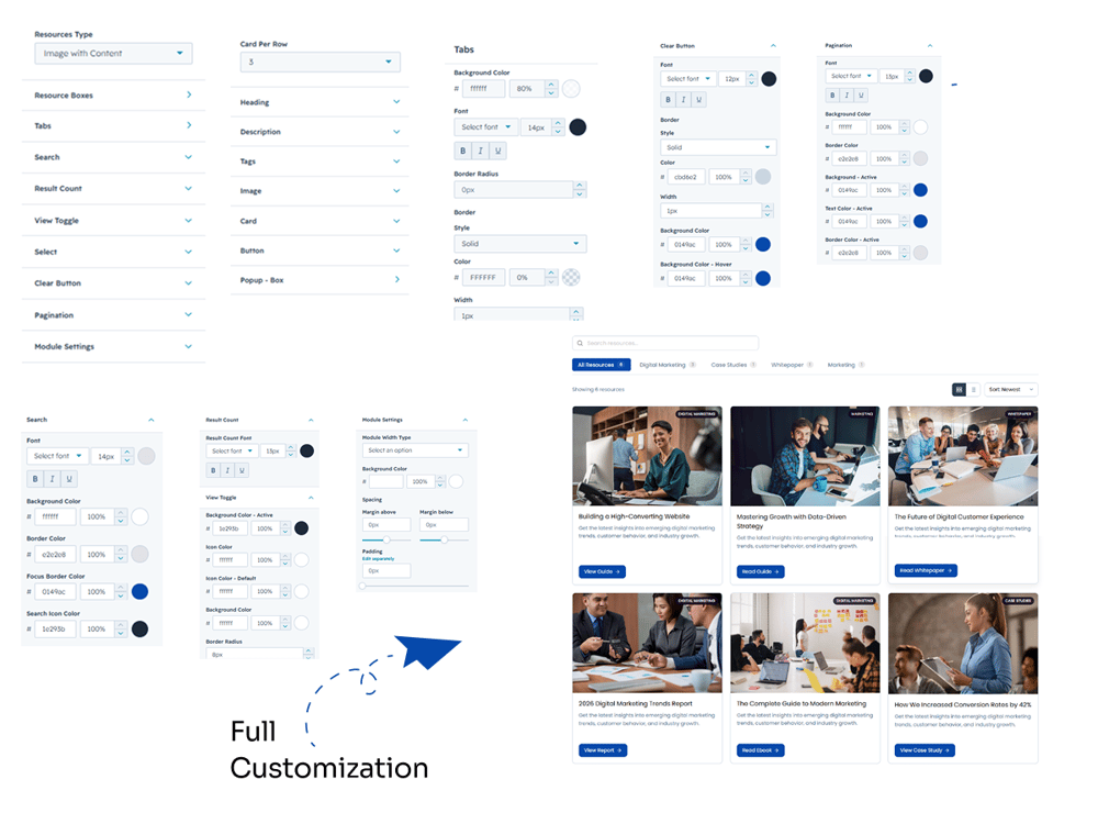
- Resources Type – Choose the resource display type for your directory.
- Card Per Row – Select how many resource cards to display in each row.
- Heading – Customize the heading font, size, style, and color.
- Description – Adjust the description typography and styling.
- Tags – Customize the appearance of resource tags.
- Image – Control the styling and appearance of resource images.
- Card – Customize the card background, border, radius, spacing, and padding.
- Button – Style the resource card buttons to match your website design.
- Popup - Box – Customize the popup box appearance, including background, width, and styling.
- Tabs – Customize tab background, text, border, radius, active state, and hover colors.
- Search – Style the search field with font, background, border, focus border, and search icon colors.
- Result Count – Customize the result count font, background, text, and border styling.
- View Toggle – Customize the grid/list view toggle, including active and inactive colors.
- Select – Style the sorting/select dropdown to match your design.
- Clear Button – Customize the clear button font, border, background, hover, and other styling options.
- Pagination – Customize pagination font, background, text, border, and active-state colors.
- Module Settings – Set the module width to full or custom, and customize the background color and overall spacing.
6. Examples / Demo Preview
View the module in action: https://www.modfrybus.shop/resource-directory-pro
7. Support & Contact
For questions or support, contact us at productqueriemodfrybus@outlook.com We’re happy to help!