
5. Module Settings Guide
Content Tab:
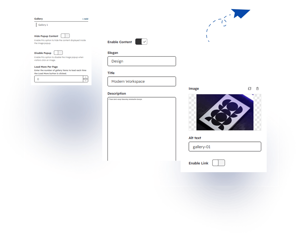
Gallery
Add multiple gallery items with images, content, and optional custom links.
Hide Popup Content
Enable this option to hide the content displayed inside the image popup.
Disable Popup
Enable this option to disable the image popup when visitors click an image.
Load More Per Page
Set the number of gallery items to load each time the Load More button is clicked.
Gallery Item
Enable Content
Enable this option to display content with the gallery image.
Slogan
Add a short slogan or label to display with the gallery item.
Title
Add a title for the gallery item.
Description
Add a description to provide additional information about the gallery item.
Image
Select or upload an image to display in the gallery.
Enable Link
Enable this option to add a custom link to the gallery item.
2. Style Tab
Gallery Content
Customize the fonts, colors, text styles, and appearance of gallery content.
Load More
Customize the Load More button font, colors, text style, background, and hover effects.
Popup Modal
Customize the popup background, image display, content typography, and text styling.
Gallery Content Typography
Slogan Font
Customize the font, size, style, and color of the gallery slogan.
Heading Font
Customize the font, size, style, and color of the gallery heading.
Description Font
Customize the font, size, style, and color of the gallery description.
Image Height
Set maximum and minimum image heights for desktop, tablet, and mobile devices.
Load More Button
Text Font
Customize the font, size, style, and color of the Load More button text.
Background Color
Set the background color of the Load More button.
Box Shadow
Customize the box shadow of the Load More button.
Background Color – Hover
Set the background color displayed when visitors hover over the button.
Text Color – Hover
Set the text color displayed when visitors hover over the button.
Popup Modal
Background Color
Set the background color of the popup modal.
Image Object Fit Type
Choose how the image fits within the popup container.
Slogan Font
Customize the font, size, style, and color of the popup slogan.
Slogan Text Transform
Choose how the popup slogan text is displayed.
Title
Customize the popup title with font, size, style, and color settings.
Description
Customize the popup description with font, size, style, and color settings.
Close Icon Color
Set the color of the popup close icon.
Arrow Color
Set the color of the popup navigation arrows.
Popup Box Shadow
Customize the box shadow applied to the popup modal.
Zoom Icon
Zoom Icon Color
Set the color of the zoom icon displayed over gallery images.
Zoom Background Color
Set the background color behind the zoom icon.
Module Spacing
Margin Above
Set the space above the module.
Margin Below
Set the space below the module.
Padding
Adjust the internal spacing of the module.
Module Width Type
Choose how the module width is displayed within the page layout.
.jpg?width=1000&height=790&name=Frame%20(3).jpg)