5. Module Settings Guide
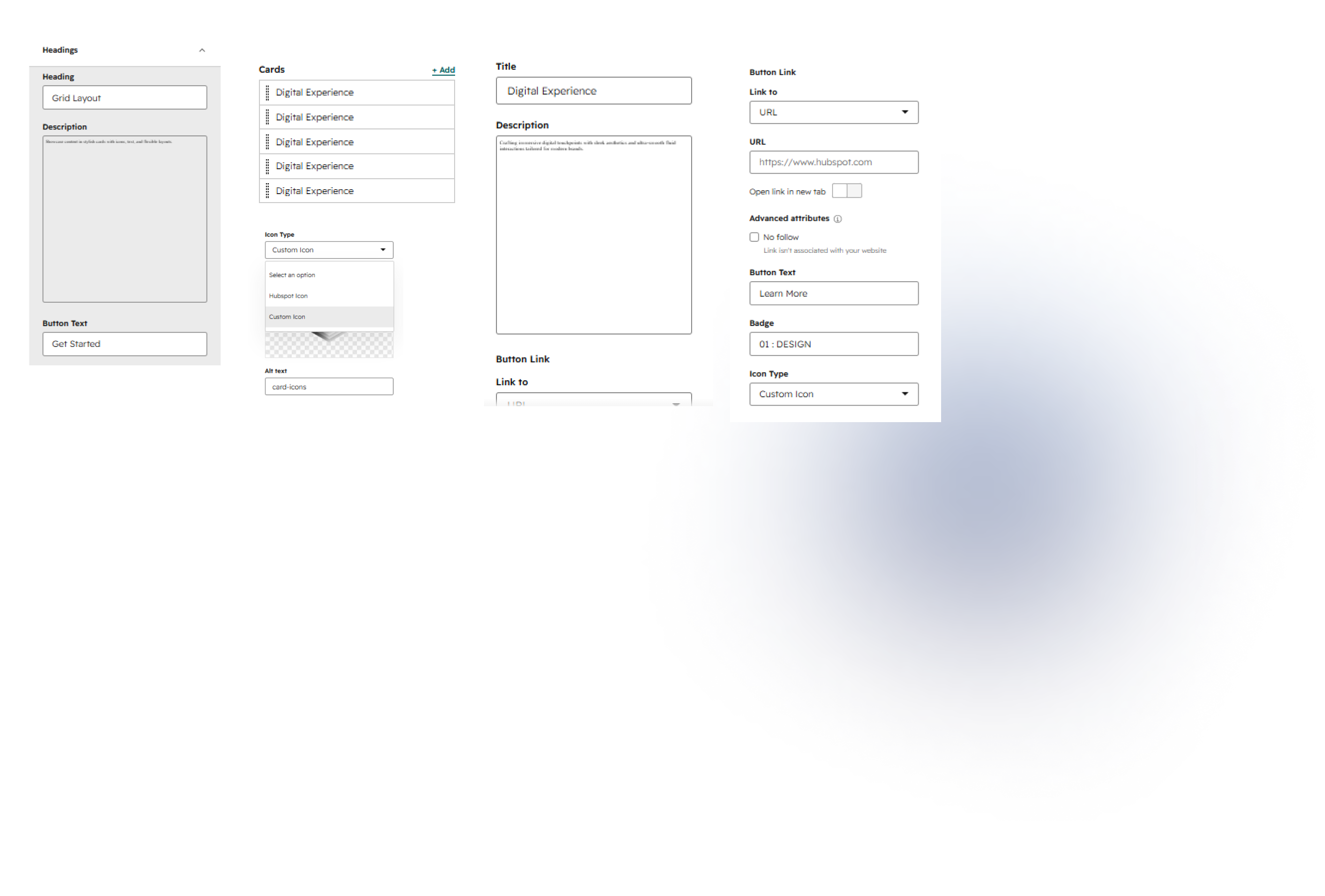
Content Tab:
Heading
Add a heading to introduce and highlight your card section.
Description
Add a short description to provide additional context for your card section.
Button Text
Enter the text you want to display on the main section button.
Button Link
Choose where the button should link, such as a URL or HubSpot page.
Card Inner
Title
Add a title to highlight the main content of your card.
Description
Add a short description to provide additional information about the card.
Badge
Add a badge or label to highlight important card information.
Button Text
Enter the text you want to display on the card button.
Button Link
Choose where the card button should link.
Icon Type
Choose between a HubSpot icon or a custom icon for your card.
2. Style Tab
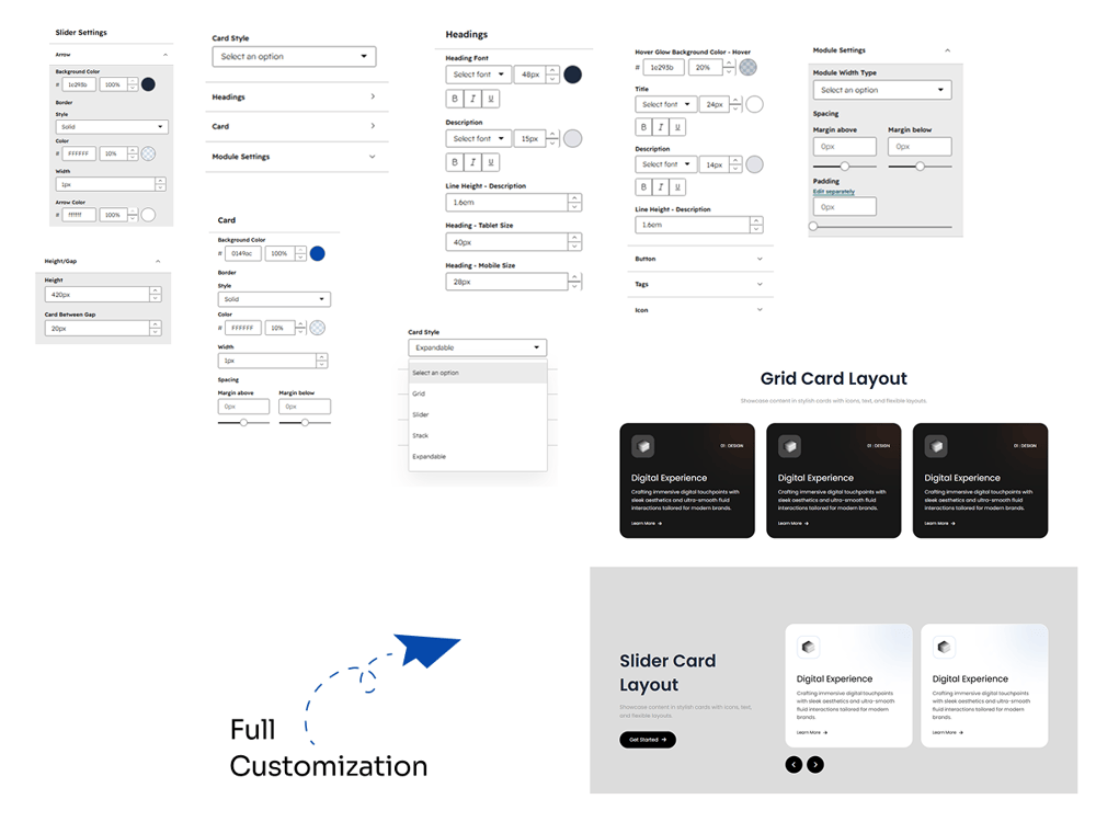
Card Style
Card Style
Choose a layout style for your cards, including Grid, Slider, Stacked, or Expandable.
Background Color
Customize the background color of your cards to match your website design.
Border
Set the border style, color, and width for your cards.
Spacing
Adjust the top and bottom margins to control the spacing around card.
Headings
Heading Font
Customize the heading font family, size, weight, and text style.
Heading Color
Choose a color for your card headings.
Description Font
Customize the description font family, size, weight, and text style.
Description Color
Choose a color for your card descriptions.
Line Height – Description
Adjust the line height of the card description for better readability.
Heading – Tablet Size
Set the heading font size for tablet devices.
Heading – Mobile Size
Set the heading font size for mobile devices.
Card
Card Background Color
Choose a background color for individual cards.
Card Border
Customize the card border style, color, and width.
Card Spacing
Adjust the margin above and below cards.
Hover Effect
Hover Glow Background Color
Choose the glow color that appears when users hover over a card.
Hover Glow Opacity
Adjust the opacity of the hover glow effect.
Hover Title Color
Customize the title color when hovering over a card.
Hover Description Color
Set the description color for the hover state.
Hover Line Height
Adjust the description line height during the hover state.
Button
Button Style
Customize the button appearance, including typography, colors, borders, and spacing.
Tags
Tag Style
Customize the appearance of card badges or tags, including colors, typography, and spacing.
Icon
Icon Style
Customize the icon size, color, background, border, and spacing.
Slider Settings
Arrow Background Color
Choose the background color for slider navigation arrows.
Arrow Border Style
Customize the border style, color, and width of slider arrows.
Arrow Color
Set the color of the slider navigation arrows.
Slider Width
Adjust the width of the slider navigation arrows.
Height / Gap
Height
Set the overall height of the card layout.
Card Between Gap
Adjust the spacing between cards.
Module Settings
Module Width Type
Choose how the module width should be displayed within the page layout.
Margin Above
Adjust the spacing above the module.
Margin Below
Adjust the spacing below the module.
Padding
Set the internal spacing around the module content.