Skip to content

Content Tabs Slider Documention

1. Introduction (Overview)

The Content Tabs Slider module helps you display content in an interactive tabbed layout. It includes both Horizontal and Vertical tab styles, allowing you to choose the layout that best fits your website design.

Each tab can contain its own content and image. When a visitor clicks on a tab, the corresponding content and image are displayed instantly. The built-in image slider works alongside the tabs, ensuring smooth navigation between content sections.

The module is fully responsive and includes customizable image height settings for desktop, tablet, and mobile devices. It is ideal for showcasing services, features, products, case studies, portfolios, and other structured content.

2. Key Features

• Horizontal & Vertical Layouts – Choose the tab style that best fits your content.

• Multiple Tabs Support – Add and manage multiple content tabs with ease.

• Interactive Tab Navigation – Switch between content sections with a single click.

• Synced Tabs & Images – Tabs and images update together for a smooth experience.

• Image Slider Controls – Navigate content using built-in previous and next controls.

• Custom Image Heights – Set separate image heights for desktop, tablet, and mobile.

• Easy Content Management – Easily add, edit, and organize tabs, content, and images from the module settings.

• Fully Responsive Design – Optimized for desktop, tablet, and mobile devices.

3. Installation – Downloading the Module from HubSpot Marketplace

  • Log in to your HubSpot account.
  • Go to the Marketplace from the main navigation menu.
  • Search for your module by name.
  • Find the module in the results and click Install.
  • If it’s a paid module, you can also click Buy Now to purchase and install directly.

4. How to Use – Adding the Module to Your Page

  • Open your HubSpot page editor.
  • Click on Add Module.
  • Search for your module by name.
  • Drag and drop the module into the desired section of your page.
  • Content Tabs Slider helps you organize and display content using tabs. Users can switch between tabs to view different content and images. The module supports both horizontal and vertical layouts and works smoothly on all devices.

5. Module Settings Guide

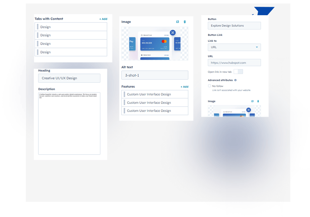
1. Content Tab 

Multiple Tabs Support – Easily add and manage multiple content tabs.
Content Customization – Add a heading, description, image, button, and feature list for each tab.**
Group 469469


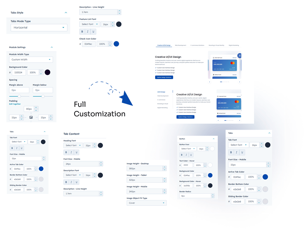
2. Style Tab

1. Layout Mode
Choose between Horizontal and Vertical tab layouts to match your design needs.

2. Module Settings
Customize section spacing, background color, and container width with full-width or custom-width options.

3. Tabs Customization
Control tab typography, font size, text color, active tab color, border-bottom color, sliding border color, and active sliding border color.

4. Content Customization
Customize heading font, size, mobile size, color, description typography, line height, feature list font settings, feature text color, and check icon color.

5. Button Customization
Adjust button font, size, text color, spacing, background color, hover background color, and other button styles.

6. Image Height Customization
Set separate image heights for desktop, tablet, and mobile devices.

7. Slider Settings
Customize arrow color, arrow background color, active arrow color, and slider dots color.**
 

Group 469466


6. Examples / Demo Preview

View the module in action: https://www.modfrybus.shop/content-tabs-slider

7. Support & Contact

For questions or support, contact us at productqueriemodfrybus@outlook.com We’re happy to help!