5. Module Settings Guide
Content Tab:
1. Headings
- Subheading – Add a short supporting text above the main heading.
- Heading – Add the main heading for your content section.
- Description – Add a detailed description to explain your content or section.
2. Content Cards
Add multiple cards to showcase your content.
- Title – Add the title of the content card.
- Description – Add a description or summary for the card.
- Tags – Add one or more tags to help organize and filter the card.
- Button Text – Add the text displayed on the card button.
- Button Link – Set the destination for the card button.
- Feature Image – Add an image to the content card.
3. Category
Use the Category field to assign a category to each content card.
- Category – Add a category name to organize and filter relevant content.
4. Filters
Add custom filters to make your content easier to browse.
- Add Filter 1 – Enable the first custom filter.
- Filter Text – Add the label or options for the first filter.
- Add Filter 2 – Enable an additional custom filter.
- Filter Text 2 – Add the label or options for the second filter.
5. Default Filter Text
Customize the default text shown in the filter dropdowns.
- All – Default Categories – Set the default text for the category dropdown.
- Add Filter 1 Default Text – Set the default text for the first filter.
- Add Filter 2 Default Text – Set the default text for the second filter.
Note: Leave the default filter text empty to automatically hide that dropdown.
6. Search Bar
Customize the search field used for filtering content.
- Search Bar Text – Add placeholder text displayed inside the search bar.
7. Hide Tabs
- Hide Tabs – Enable this option to hide the tabs from the content section when they are not required.
8. No Result Message
- No Result Message – Add the message displayed when no content matches the selected filters or search query.
9. Load More
- Load More – Configure the text and behavior for loading additional content cards.
10. Clear Filters
- Clear Filters – Configure the option that allows visitors to reset the selected filters and view the content again.
.png?width=1000&height=700&name=Group%201000002455%20(1).png)
2. Style Tab
Heading:
Customize every part of your content filter with flexible styling and layout controls.
Full Details
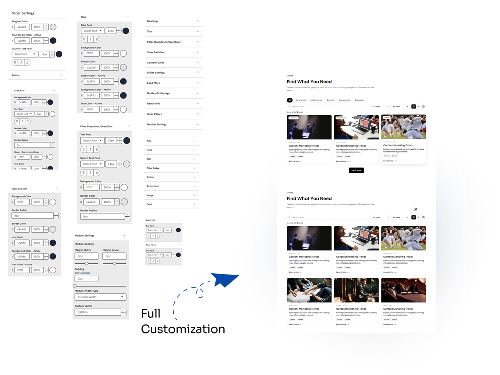
The Style tab gives you complete control over the appearance of the Content Filter Pro module. Customize individual elements, colors, typography, spacing, borders, and layouts to match your website design.
Slider Settings
- Progress Color – Customize the slider progress indicator color.
- Progress Bar Color – Set the color of the slider progress bar.
- Counter Text Color – Change the color of the slider counter text.
- Arrows – Customize the appearance and styling of slider navigation arrows.
Load More
- Background Color – Set the background color of the Load More button.
- Text Font – Customize the button typography.
- Border Color – Set the button border color.
- Border Radius – Adjust the roundness of the button corners.
- Hover Background Color – Choose a different background color for the hover state.
- Text Color – Customize the button text color.
Tabs
- Tabs Font – Customize the tab typography with font, size, and text formatting options.
- Background Color – Set the default tab background color.
- Border Color – Active – Customize the border color of the active tab.
- Background Color – Active – Set a different background for the active tab.
- Text Color – Active – Customize the text color of the active tab.
Filter Dropdown / Searchbar
- Text Font – Customize the typography of dropdown and search text.
- Search Text Font – Control the typography used inside the search field.
- Background Color – Set the background color of filters and search fields.
- Border Color – Customize their border color.
- Border Radius – Adjust the corner radius for a softer or sharper appearance.
View Switcher
- Background Color – Set the background color of the view switcher.
- Border Radius – Adjust the corner roundness.
- Border Color – Customize the switcher border.
- Icon Color – Set the default icon color.
- Icon Color – Active – Set a separate color for the selected view icon.
Module Settings
- Module Spacing – Control the spacing around the module.
- Margin Above – Adjust the space above the module.
- Margin Below – Adjust the space below the module.
- Padding – Add and customize internal module spacing.
- Module Width Type – Choose how the module width is controlled.
- Custom Width – Set a specific custom width when using the custom width option.
Headings
Customize the styling of module headings with dedicated typography and appearance controls.
Content Cards
The Content Cards section provides styling controls for individual card elements, including:
- Title
- Meta
- Tags
- Filter Badge
- Button
- Description
- Image
- Card
Each element can be styled independently to create a consistent and fully customized card design.
Additional Styling Controls
- Result Info – Customize the typography and appearance of the result information.
- Clear Filters – Style the Clear Filters control to match your design.
- Responsive-Friendly Styling – Create a consistent appearance across different screen sizes.
This gives you full customization over the module's filters, tabs, cards, slider, buttons, typography, colors, borders, spacing, and overall layout.